But if you have added a chart to your Google Sheets spreadsheet, you may have found that you don’t initially have the option of changing the chart type to something else, such as a histogram. Fortunately you can make a histogram in Google Sheets, although the method is slightly different than you may have experienced with Excel.
How to Make Histogram in Google Sheets
Our article continues below with additional information on making a histogram in Google Sheets, including pictures of these steps.
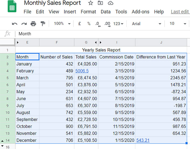
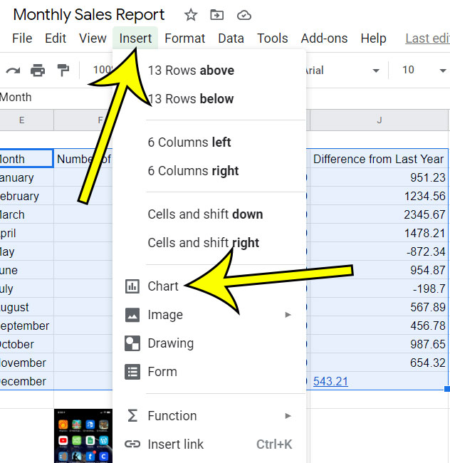
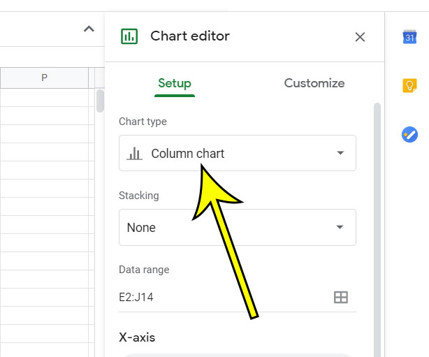
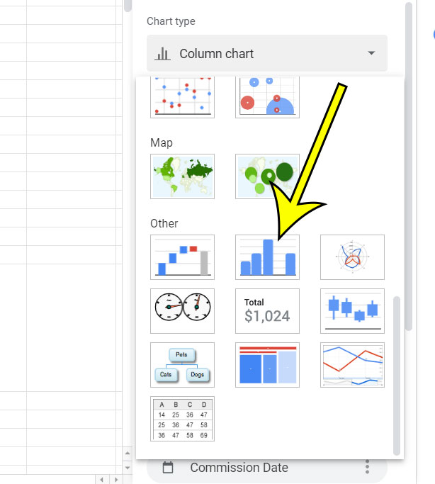
How to Create a Histogram in Google Sheets (Guide with Pictures)
The steps in this article were performed in the desktop version of the Google Chrome Web browser, but will also work in other desktop browsers like Mozilla Firefox or Microsoft Edge.
How to Customize Your Histogram in Google Sheets
You can then adjust the settings in the “Chart Editor” column at the right side of the window to change the various options for displaying the histogram chart. The Customize column in the Chart editor includes tabs for:
Chart & axis titlesSeriesLegendHorizontal axisVertical axisGridlines and ticks
Under each of those tabs are assorted ways that you can affect the display of your chart data. Note that you can modify the chart type at any time, to one of many other options, using these same steps above. However, in many cases, you will need to make adjustments to the setting to accommodate the new chart type.
More Information on Making a Histogram Chart in Google Sheets
Note that one of the options available to you after creating your histogram charts is to switch the vertical axis and the horizontal axis. Sometimes Google Sheets has some trouble determining which data should be used on which axis, so you may need to change their selection in the chart editor.While you can manually choose which data to use in the X axis and the Y axis, there is also a button at the bottom of the chart editor column that lets you switch rows and columns.The Setup tab in the Chart Editor includes some of the more basic settings that you need for the chart. However, if you are looking for some more in depth customization options that you can click the Customize tab in that column and really take control when you create a histogram in Google Sheets.After you are finished with your histogram chart you might want to use it in another application, such as Google Docs or Microsoft Word. If you click the three dots at the top right corner of the chart you can select the Download option, then choose an image type. That downloaded picture can then be added to a document in the same way as any other image.
Additional Reading
How to change the orientation of a printed spreadsheet in Google SheetsHow to sort a column from high to low in Google SheetsHow to print with gridlines in Google SheetsHow to copy multiple rows in Google SheetsHow to change cell border color in Google Sheets
He specializes in writing content about iPhones, Android devices, Microsoft Office, and many other popular applications and devices. Read his full bio here.


